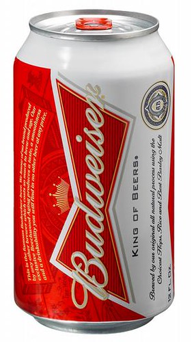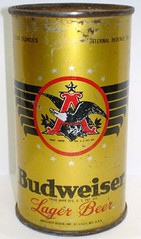

Anheuser-Busch has trotted out a new design for their flagship Budweiser beer - the 12th redesign of the can in 75 years. They've done a pretty good job of deemphasizing all that fussy verbiage on the former label, placing most of the visual emphasis on the Budweiser "bow tie." (I don't think that's really a bow tie. Take a look at it on end, as in the photo at left, and it looks a lot more like a traditional beer glass.)
Personally, I think that the elegant lines of the original 1936 can are timelessly appealing and would have been a better choice (the company did release a limited-edition repro can a few years ago, so someone at Anheuser-Bush must agree with me.)
No matter what kind of label is on the can, though, it's what's inside that counts, and this tweet pretty much sums up the real problem with Bud:


No comments:
Post a Comment
All comments are moderated and will appear after approval. Please keep it civil. Rude, belligerent, or jerkish comments will be removed, as will spam.
Thanks!