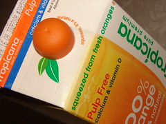
 This seems to be a hot time for package redesign. Tropicana Orange Juice cartons are sporting a new, cleaner, more modern design with lots of big, lower-case sans-serif lettering and plenty of wide orange and white spaces.
And check out the cap on the pouring spout - it's a little plastic orange now! Isn't that cute?

yet... they are trashing it all and going back to the original. Consumers hated it!
ReplyDelete...but the cute orange on the spout will stay.